 Kinnetly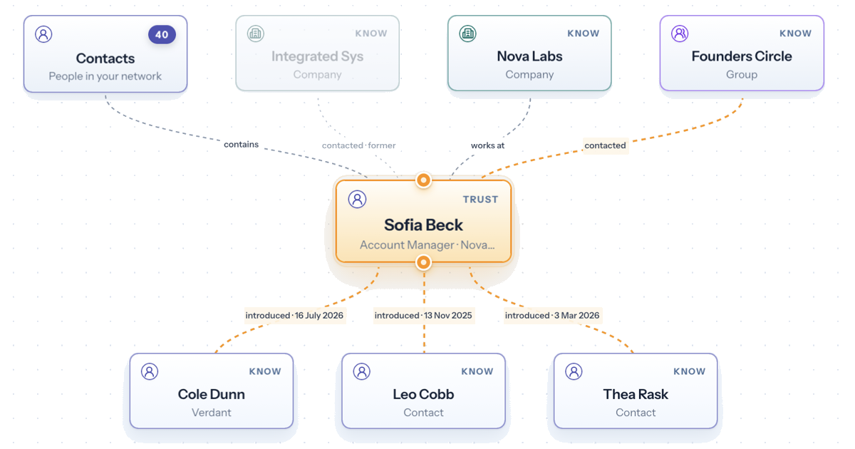
A contact form can tell you someone’s name, job title, phone number, and company.
That is useful. It is also strangely incomplete.
Because the thing you are usually trying to remember is not only who the person is. It is how they fit into your world. Who introduced you? Where did you meet? Which company, event, or group connects you? What made the conversation worth remembering?
That is why a graph-based personal CRM feels different from a traditional contact database. Forms store facts about people. A relationship graph shows the shape between them.
The problem with flat contact records
Most CRMs were built around records. A person has fields. A company has fields. A deal has fields. If something does not fit neatly, it goes into notes.
That works well for structured data: email address, phone number, role, company, status.
It works less well for relationship memory.
The human part usually ends up buried in a notes box:
- met at the Brisbane founder event
- introduced by Priya
- talked about hiring a first support person
- knows Sam from Acme
- might be useful to reconnect before the next conference
None of that is obscure. It is often the most useful information you have. But inside a form, it becomes a paragraph you have to remember to read.
The database may have the answer. The interface hides the shape.
Relationships are not rows
A relationship is rarely one isolated contact.
One person is connected to an event, a company, a mutual friend, a previous introduction, a group chat, a project, and a handful of conversations. The useful meaning sits in those links.
That is why visual maps feel natural for this kind of information. Network analysis uses nodes and edges to represent connected things, because the connection is part of the data, not decoration. Researchers describe network analysis as a way to represent relationships between actors and reveal features of a network that are hard to see from isolated records.
In plain English: the lines matter.
If Priya introduced you to Sam, and Sam later introduced you to Alex, that chain is relationship context. You can write it in a note, but it is easier to understand when you can see it.
Visual structure reduces the remembering work
Good visualisation is not about making data look nicer. It is about making information easier to think with.
Research on decision making with visualisations points to two useful modes: fast, low-effort understanding and slower, more reflective analysis. That maps well to relationship work. Sometimes you just need the quick answer: "How do I know this person?" Other times you want to think more carefully: "Who is the right person to ask for this introduction?"
A flat list makes both questions harder than they need to be.
A graph gives your memory more hooks. You can recognise a person by their position: connected to that company, introduced through that event, sitting near those people. The context is visible before you open a notes field.
That matters because relationship data is easy to forget and awkward to reconstruct later.
Who introduced whom should be visible
Warm introductions are one of the clearest examples.
In a normal CRM, "introduced by Priya" might sit in a custom field or a note. That is better than nothing, but it treats the introduction as a label on Sam.
A relationship map treats it as a connection between Priya and Sam, with you in the middle of the story.
That changes how you use the information.
You can see who connected you to whom. You can remember to thank the right person. You can avoid asking someone for an introduction when the relationship is too weak. You can notice that several people came through the same event or community.
The relationship stops being buried text. It becomes part of the map.
When a list is still better
Graphs are not better for everything.
If you need to sort 500 contacts by company name, a table is useful. If you need to export email addresses, a list is the right tool. If you are checking whether someone has a phone number saved, a form is fine.
The point is not that every interface should be a spiderweb.
The point is that relationship context is connected information. When the question is "how are these people connected?" or "where did this person come from?", a graph is a better starting point than a flat record.
The best systems use both. Tables for scanning and editing. Forms for precise details. A map for the relationship structure.
A graph should make things clearer, not busier
There is a trap with visual networks: they can become cluttered.
A good relationship map should not throw every possible detail on the screen at once. UX guidance for graph visualisations tends to emphasise the same point: the goal is effortless understanding of complex relationships, not visual noise.
That means the map needs focus.
Sometimes you want the whole network. Sometimes you only want one person and their direct connections. Sometimes you want to follow an introduction path. Sometimes you want to open the details panel and read the notes.
The visual layer should help you choose where to look next.
Why this matters for a personal CRM
A company CRM is often built around pipeline: leads, deals, stages, revenue.
A personal CRM has a different job. It needs to help you remember people in context. Not just what they do, but how you know them, who connects you, and what would make the next conversation feel natural.
That is why graph-first design matters.
It matches the shape of the problem.
Your network is not a spreadsheet of strangers. It is a set of relationships built through people, places, timing, and trust. The more your system reflects that, the less work your memory has to do.
How Kinnetly uses this idea
Kinnetly is built as a private relationship map. Contacts, companies, events, and groups become connected nodes, so you can see how your network fits together instead of storing everything in a notes field.
You can record who introduced whom, where a relationship started, and what context matters for later. You can focus on one person and their direct connections, or step back and see the broader map.
It is still useful to have notes and details. Kinnetly has those too. But the graph gives the notes a place to live.
If you have ever looked at a contact record and thought, "I know this person, but I cannot remember how," the problem may not be your memory. It may be that the information was stored in the wrong shape.
A relationship map gives it the shape back.
You can see how Kinnetly works, or get started with Kinnetly for free.